Architecture has evolved a lot in a few centuries. Before the twentieth century, the most luxurious trend anyone could aspire for their home was one where the sets were exuberant. However, today a minimalist house is synonymous with elegance and luxury, all a 180-degree turn.
As the name suggests, minimalist design is the lack of details that simply overload the construction, including furniture, with the intention of creating spaces with more freedom where people can feel at ease.
Many people believe that modern minimalist is equal to eliminate all design traits of our home, but the truth is that it is a more complex style to achieve than it seems.
When conceiving a minimalist house, the architect must think how a set of simple elements can be coupled to create functional spaces that can captivate our attention without resorting to the use of tricks such as wall moldings or immense architectural elements.
Minimalism is characterized by the following elements:
- Its form and function are simple, usually limited to pure geometric figures.
- The finishes and coatings tend to be smooth.
- The internal walls are reduced in quantity, and the external walls are replaced by windows.
- The decorations are kept to a minimum.
Minimalist decor: tips & tricks
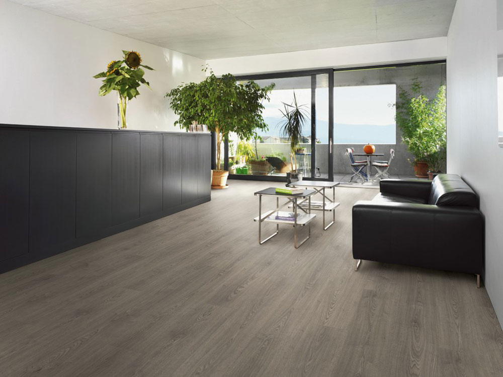
Image source: Beronio Lumber
When designing a minimalist house, always keep in mind the basic concept that less is more. That is, everything that is not really necessary must be eliminated.
What should we keep in our decoration? Only that which is essential or is extremely expensive. Like a classic interior, leaving the objects of extreme value in view will generate an important visual impact, but unlike the latter, minimalism also highlights them by eliminating everything around them.
By removing the furniture that we do not need (which is more than what one considers), we will begin to feel like our home gains an important space.
We look for quality, not quantity
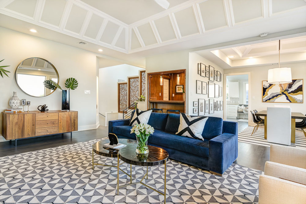 Image source: Triple Heart Design, LLC
In the minimalist home decor, it is important that we maintain the quality of our decoration. There are several ways to do this, as well as of course, to acquire luxurious decoration pieces. The first is simply removing everything that does not serve us. By leaving only occasional furniture, its aesthetic value will increase considerably. Our visitors will immediately think that they are facing something important.
Another way to save space in a minimalist decoration is through multipurpose furniture, such as reclining sofas. In that way, those actions that required two furniture will now be concentrated on just one.
Find that the entire design speaks on its own. Use unique decorations in their type, abstract pieces, or things that look expensive and luxurious. Remember that we will only use a few, so these should be flashy enough.
Even in minimalism, disorder is necessary
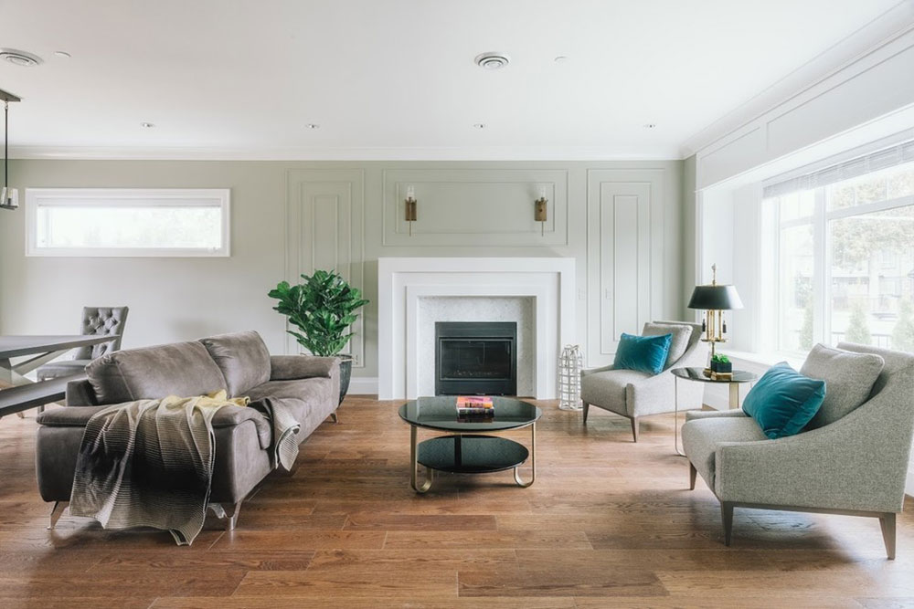 Image source: Linhan Design & Interiors Co.
A minimal style to its maximum expression is something that nobody looks for, basically because then everything would be very boring. However, the disorder we are talking about does not have to do with forgetting what we mentioned previously and placing furniture everywhere.
On the contrary, we must be inspired by the best disorder of all: nature. The natural elements create a slight controlled disorder that does not overwhelm us; on the contrary, they give life to our home.
The ways of taking nature to our minimalist house are very varied. We can use popular interior paint colors like beige or light browns to paint our rooms. We can be more modest by combining white with gradients of natural colors like light green. Using these techniques in our minimalist home will control the balance between simplicity and clutter.
Decorate smart with the use of light
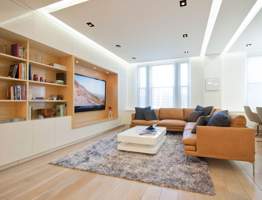 Image source: StudioLAB
As we mentioned previously, the light in a minimalist home is paramount. Not only does it create more spacious and welcoming areas, but also it will be another element of the decoration. How is this possible?
Simple. Study how the sun’s rays affect your home and use it to your advantage. Locate furniture or install window treatments that allow you to control how shadows are generated. Create interesting patterns, or use it as if it were a reflector to give importance to a piece of furniture.
Say goodbye to the gaudy colors
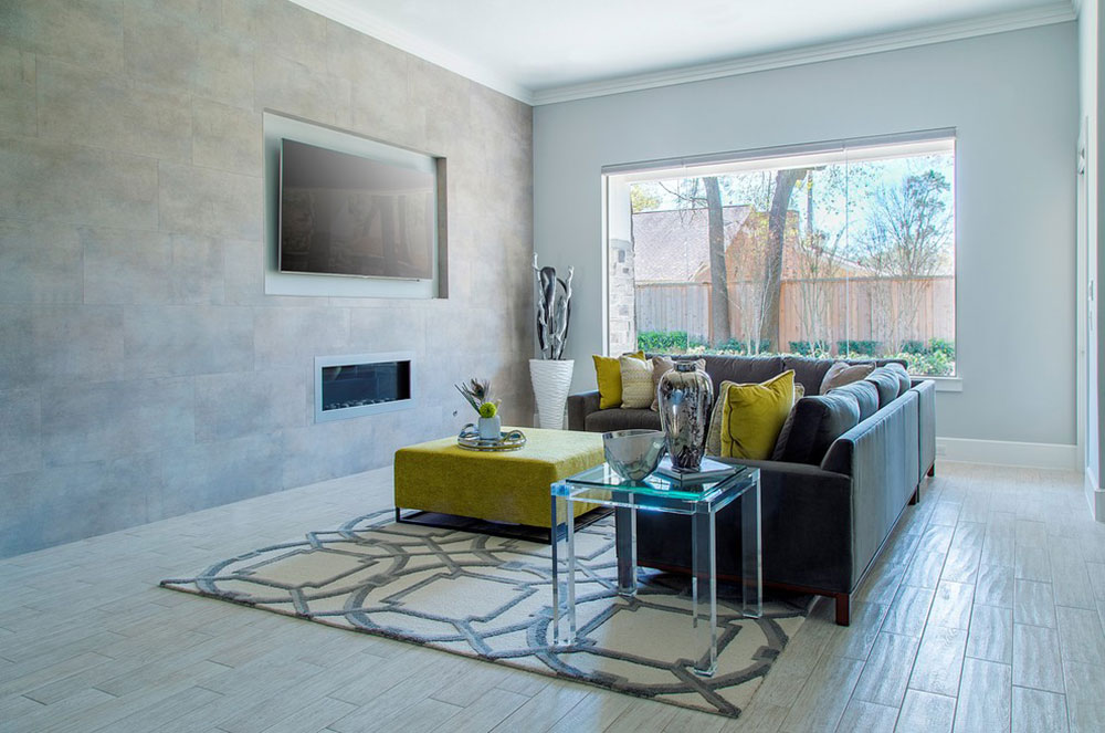 Image source: By Design Interiors, Inc
You have already inferred it from the images we have shown you, but here is the reminder. A minimalist house is totally the opposite of strong color. The colors used for this style are white, pastel colors and neutral tones. These allow us to create cleaner spaces that are not so heavy to inhabit.
In general, we will limit ourselves to the use of 2 colors, which can be combined with our decoration, like the image we show you of the marble table.
Choose natural tones, light green, beige, brown, light blue, among others. The strongest paint we can use is black, and it combines very well with any color, but its counterpart is always cleaner in a room.
The lack of objects translates into better management of balance, proportion, and harmony
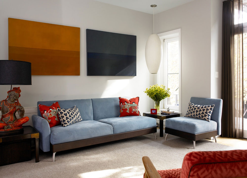 Image source: CWB Architects
These three words are basic concepts in the design of homes. Usually, in a traditional home, they tend to lose sight of these concepts because of the large number of furnishings. However, in a minimalist house, these elements are extremely notorious.
Each piece that we use will be widely visible and comparable with its environment, which can alter the balance of the design. If we only place objects randomly, then harmony will be affected. The last concept, the proportion, goes hand in hand with the previous two, being more a result between them.
As an example of these concepts, we have pillows and cushions. On a sofa, to maintain visual balance, the idea is to place the same number of cushions on both sides. If we choose something more daring, such as putting them along with the entire sofa, then we must maintain harmony by using patterns that indicate that they are not placed randomly. Finally, we must take care of the proportion in which we use them, not exaggerating in their quantity or size.
Adhere to the room’s function
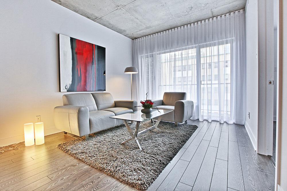 Image source: Condos Samcon
The minimalist room decor is about using only what is really necessary. For example, if it is the living room, the set will be a sofa, a table, and the entertainment center. Remember the primordial function of the space and you can decorate it efficiently.
Create focal points with plants or works of art
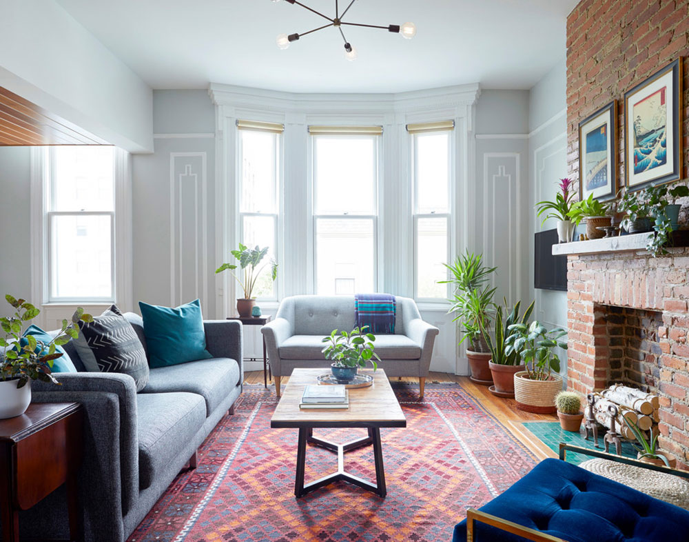 Image source: Linda Cava
A minimalist interior does not completely renounce the use of plants as decoration. They just are used at key points, decorating spaces where they are really needed. It does not matter if they are small pots on the tables or large plants on the floor, the vegetation will always give life to our home.
Another way to create focal points is through the use of works of art. Unlike classic styles, in a minimalist house, we will limit ourselves only to great unique pieces. We will avoid cramming our wall with small paintings that all they do is cause anxiety to their viewer.
If you want to create a really interesting point with a work of art, use one that has very different colors to the palette you used in your home. This masterpiece will be all you need to give character to your wall without overloading it.
Any object can generate contrast
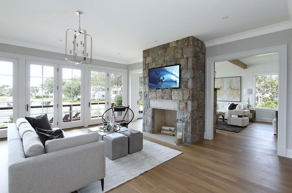 Image source: BA Staging & Interiors
An advantage of the minimalist design is that no matter what object we place in the middle of our room, it will always stand out. The neutral colors of the walls are a kind of blank canvas, and our furniture is like brushstrokes of paint.
The simplest object becomes important when they are not surrounded by other things, so bear in mind even those elements that you thought were too common to highlight.
Do not rule out the patterns completely
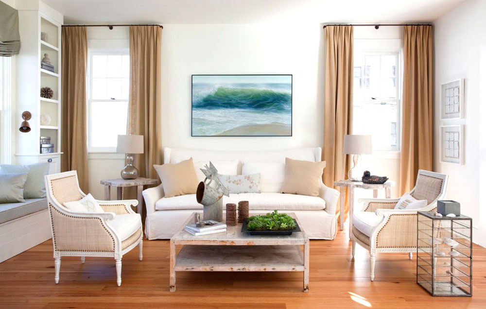 Image source: Lisa Tharp Design
As with all previously mentioned elements, the patterns in paintings and fabrics can be used, but at minimum expression. With this, we mean that we must be subtle and only apply a few.
If they are curtain upholstery, try to have the same design as that of the cushions or vice versa. All furniture that can use the same pattern with the same colors should have it.
Still, remember that minimalist furnishings are better if they use neutral colors without patterns, which helps to highlight the geometric shapes they have.
The windows are not exempt from the minimalist style
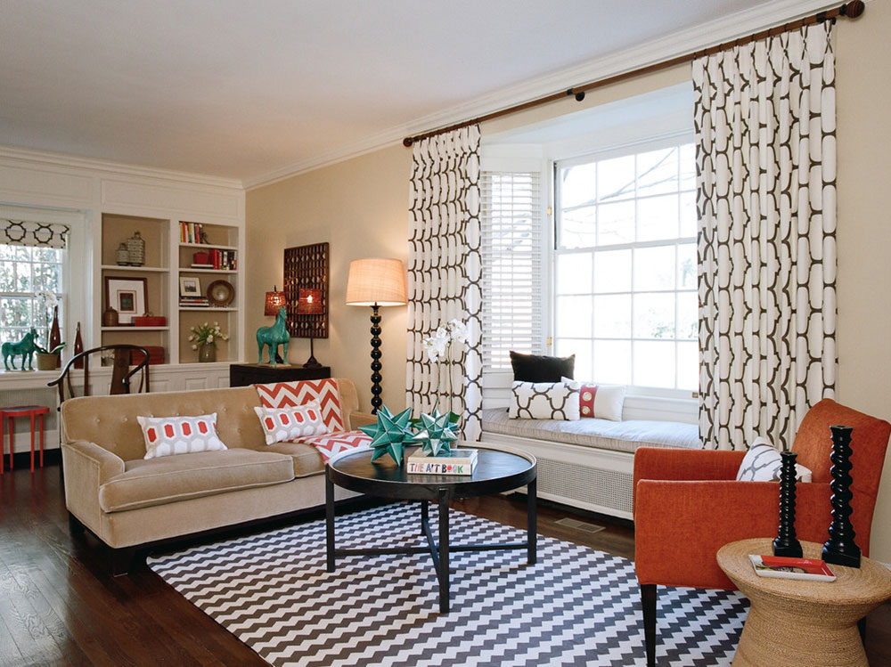 Image source: Jessica Dauray Interiors / Elements Of Style
If we want to cover our windows with a curtain or blind, they should be simple, with plain colors or, as we indicated before, with patterns that resemble as much as possible the rest of the furniture.
In regards to the window itself, aluminum frames are a safe option if we do not know what to install. Some alternatives to classic swing windows are those that open upwards or those that slide on a rail. This is a very broad section, where the most important thing is that the design we choose is clean and as wide as possible.
An important clarification: just because we use a minimalist design it does not mean that we will leave security aside. If the window requires a lattice, do not hesitate to install it.
Even our cabinets will be clean
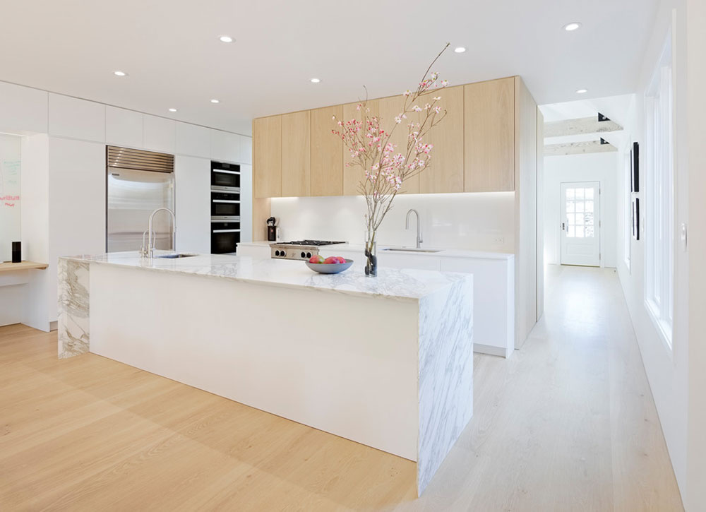 Image source: Hayasa Flooring Design, Inc
Those shelves and tables that we used to display any number of things we had will become part of the minimalist movement. This means that we will only use them for small specific items, and everything else will be stored in the closet (or in any other storage area out of sight).
Look at the image of this kitchen and you will appreciate how only a series of important artifacts give enough life to the environment.
If you enjoyed reading this article about Minimalist House, you should read these as well:
- How To Design A Minimalist Garden
- Minimalist Living Room Ideas You should Apply In your House
- Minimalist And Practical Modern Kitchen Cabinets
The post How to decorate a minimalist house: Tips and pictures you should see appeared first on Impressive Interior Design.
source https://www.impressiveinteriordesign.com/minimalist-house/
No comments:
Post a Comment